The look defines the look of the component.
Changed values are displayed directly on change in most settings, at the latest when leaving the cell or by pressing Enter / Return.
Depending on the component, the following options are available:
Name |
function |
TextFormat |
Select the font color and size, and the alignment and formatting. |
Effects |
Activate shade and/or reflection as an effect. The settings of the effects is done in the individual tabs. The changes are carried out immediately . |
Corner radius |
Adjust the corner radius of the component in pixel. The changes are carried out immediately . |
Border |
Set the color of the border. The changes are carried out immediately. |
Border thickness |
Adjust the thickness of the border in pixel.The changes are carried out immediately. |
Visible |
Visibility default. If this parameter is set, the component in the is visible in the client, if not set, the component will be invisible at start up of the client. On/Off signal on the visible data point of the component will toogle the visibility. See chapter Common data points |
Transparency |
Set the transparency of the component in percent. |
Tooltip |
The tooltip appears when you hover over a component with the mouse. On touch screens the use is difficult. |
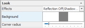
Background |
Set the background of the component. The changes are carried out immediately. |
Text |
Display text of the component may be set differently for different states of the component. |
Animation on/off |
If this parameter is set, the operation of the component is animated. |
Background & Border
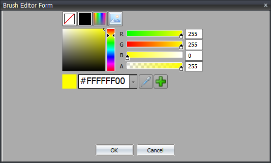
For each background property of a component you can choose between four basic types. These can be selected by the icons in the top row. From left to right the following types are available:
NullBrush, color, gradient color and image.
NullBrush
The element is invisible in this state. No mouse clicks or other user action will be accepted . The component is not present and inactive.
Color
The entire area of the background is filled with this color. The base color can be selected via the spectrum slider or via the pull-down list. In addition, the controls R (red), G (green), B (blue) and A (alpha channel -> transparency) are available for manual mixing of a hue or directly via the input of the hexadecimal color. It should be noted that the first two values represent transparency.
With the pipette a color can be taken over from any application. For example, it is possible to determine from the company's website the exact color of the logo.
The plus button adds the currently set color to the pull-down list (at the end). So it can also be selected directly. This color is then available to all elements.
Gradient color
Basically, the gradient color selection behaves as described in the solid color. In addition you can select the nature of the gradient and the number of color gradations in the bottom line.
Image
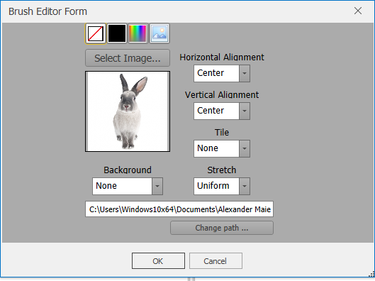
Via "Change path" the storage path of the graphics library can be changed. The change affects all components of the existing project.
This must be adjusted if the user changes, e.g. if the project is opened on another PC.
The button Select Image can be used to insert any image file from the graphics library. If the desired graphic is not yet contained in the library, it must first be added via Add. Afterwards it can be selected with a double-click.
It is also possible to drag images to the property that have a brush editor. To do this, select the corresponding property row of the component, then drag and drop the corresponding graphic onto the property. The image is imported and displayed. The graphics are not optimized.
Please note the important notes for graphics. In addition, the orientation and background of the image file can be selected.