Purpose
Using the 'Change Page' component you can change to another page by clicking on the respective button. In the properties as a function of the name of the target page from the list of available pages must be selected.
This page change will allow the display of switching states via the input "status" to be freely chosen text and / or color. With input Mouse over image, you can display the image by creating an off signal. If no signal is
present, the image is displayed when the pointer is located over the component. With the signal output of the component a boolean switch command for signaling the page jump is sent. You can choose between an on-or off signal.
Using an on / off command at the data point "Visible", the component is shown or hidden (visible /invisible) in runtime. An On command makes the component visible and an Off command invisible. You can test this feature only in runtime.
Data points of the component
Component name |
Type |
Type Function |
|---|---|---|
Disable operation (display only) |
Input |
If this input is not used, the component can always be operated. If the input is connected with an On signal, the component cannot be operated. It then only has the display function. The locked status of a component is displayed by darkening it slightly (grey) and covering it with a small lock (dark grey). |
Mouse over |
Output |
This output can be used to start an event when the mouse is moved over the object. This function only applies to the Windows client! |
Mouse over function |
Input |
The "Mouse over function" can be activated/deactivated via an on/off signal at this input. |
Switch |
Output |
When the page change is activated, another event can also be triggered. |
Switching Set value |
Input |
The value for "Switch" can be changed at runtime. |
Trigger page change |
Input |
A page change can also be triggered by an external signal. |
Visible |
Input |
If this input is not used, the component is visible. When in use, the component is switched invisible with an Off signal and visible with an On signal. |
Status input |
Input |
This can be used to switch the background (colour / text) externally between on and off. |
Text colour [ARGB-HEX] |
Input |
This data point can be used to change the font colour (if available). The desired colour is transferred as a character string. It is possible to copy the colour from the brush editor (hexadecimal value without #) in order to change the colour via a text input. |
Opacity [0-255] |
Input |
The opacity (opacity) of the component can be changed via a 1-byte value of 0-255. Here, 0 corresponds to complete transparency. The value 255 corresponds to the value that was set via the transparency in the properties. If, for example, 80% transparency is selected, this corresponds to the visual impression at the value 255 at this data point. |
For further information, see Components independent data points.
Properties
Name |
|
function |
|---|---|---|
Mouseover Text |
|
Enter the text in the mouse via function. |
Mouseover function |
|
Enable or disable the mouseover function. |
Animation On/Off |
|
Enable or disable the animation when pressed and released. |
Show current page state |
|
Enable or disable the progress bar for the current page. The status for the component is changed when the set "page change to" destination matches the current page name. See example below. |
Current page Background |
|
Displays the set color when the set "page change to" destination matches the current page name. See example below. |
Current page format |
|
Formatting for the text to be displayed |
Current page text |
|
Text that is displayed as soon as the status is true. |
Page name |
selection |
Here, the project page to be jumped to is selected. |
switch page type |
Standard |
Select the mode of operation between "Next", "Back" and page change. |
switch output |
selection |
Here, the data type for the switching procedure is set. |
ATTENTION: The display of the current page is only supported in server/client mode. The page status is not always displayed in the editor simulation.
Example:
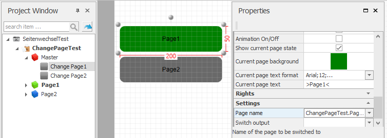
Note: You must assign the page name before you create the navigation components. At subsequent changes to the page name you must change it here also. It is not updated automatically.