The APP list view is an invisible server component with the option of creating an operating menu for a smartphone.
The menu view is programmed as a tree structure in the "App list view structure" editor.
Important:
This component must be located on a page to which the set user also has access rights.
Data points of the component
Name |
Type |
function |
|---|---|---|
Lock operation (display only) |
Bidirectional |
If this input is not used or is connected with an off signal, the commands are sent to the polar bear server. If the input is connected with an on signal, no commands are sent to the server. Since only the connection is interrupted, the app list view may show incorrect states after operation. All messages from the server are displayed. |
Dynamic |
Folder |
Folder Dynamic displays the data points of the controls. Depending on the type, different data points are provided. Link here |
Properties of the component
Name |
Standard |
Function |
|---|---|---|
Visible |
|
If this parameter is set, the component is visible on the user interface. |
App list view Structure |
|
The operating menu is configured here. |
Structure of nested list
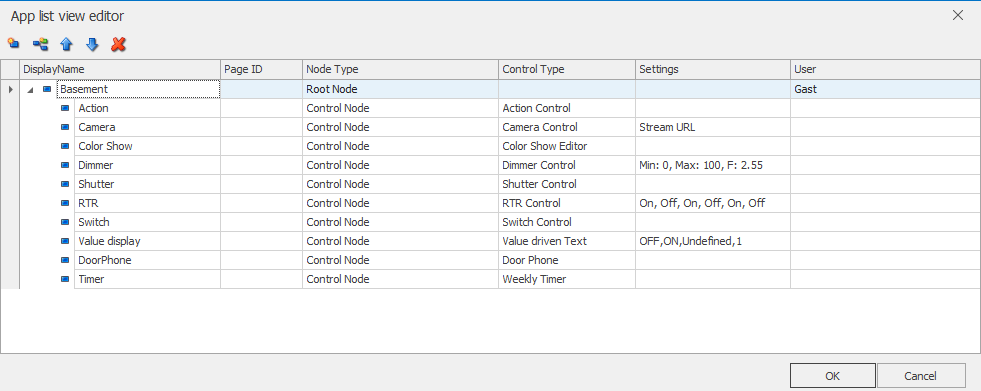
After opening the editor, there is already an entry, the root of the tree. This entry can not be deleted. You can call the root. The name then appears in the app in the title bar.
The icons in the title bar allow you to perform the following functions, from left to right. Please note the displayed tool tips.
- Add an entry in the current hierarchy level.
- Add a sub-entry to the current hierarchy level.
- Move the selected entry up.
- Move the selected entry down.
- Delete the current entry and, if necessary, all sub-entries.
Node name
Caption of the entry. This appears in the app as plain text.
page
Here you select the page which is automatically changed when you turn the app from the app list view to the graphical landscape mode. If you e.g. in the menu on the ground floor and operate there, appears after the rotation of the smart client, the graphical representation of the EC. If no page is selected, the start page of the project is called up.
node type
There can be only one base entry of the root type. Others can not be added.
The type group leads to a branch in the tree. It is used to structure the menu in building areas and / or trades. The structuring is arbitrary.
The type of control defines the actual operating and display functions. Select the desired function.
settings
If the node type control is selected and further settings exist for this type, they can be set in this column editor.
user
In this column you select in the line root the user who should use this app list view. You can choose from all configured users in the pull-down list. In this way, you can configure several app list view components in the project and thus make different functions available to different users. Be sure to only use a user once per app list view. Otherwise, the system would randomly select and display one of the AppLists.
NOTE:
- A valid user must be set in the root!
- To display percentage values with the Dimmer control element, the factor 2.55 must be set under Settings (example Dimmer: Min: 0, Max: 100, F: 2.55).
- The rules apply to the display in the value-dependent text: Formatting.
- To display a camera stream, the url to the stream must be entered, e.g. for a Mobotix camera http://IPADRESSE/control/fastream.jpg?stream=full. It is also possible to enter the URL of an image, for example from the mini-plotter.
- This component should not be created on a page that contains a plotter. Otherwise the display may be delayed. The instructions must be observed.
When you finally exit the editor with OK, the existing data points in the Dynamic folder are displayed in the data point window. The data points are displayed according to the configured app list view structure. Connect the external data points to the corresponding channels here.
Properties
Element |
Name |
Typ |
function |
|---|---|---|---|
Action Control |
Value On |
Output |
Sends the set value. |
ColorShow Control |
ColorShow |
Bidirectional |
Connection to the unVisible ColorShow component |
Dimmer Control |
StatusInput |
Input |
This input can be used to change the state of the component. |
Value |
Bidirectional |
Sends the set value. |
|
RTR-Control |
Nominal temperature |
Input |
Input for the current setpoint temperature |
Current temperature |
Input |
Input for the measured temperature |
|
Base nominal temperature |
Bidirectional |
Input / output of the base setpoint temperature |
|
Comfort - Value On |
Output |
Specifies the set data type / value for this input / output. |
|
Comfort - Value Off |
Output |
Specifies the set data type / value for this input / output. |
|
Night - Value On |
Output |
Specifies the set data type / value for this input / output. |
|
Night - Value Off |
Output |
Specifies the set data type / value for this input / output. |
|
Standby - Value On |
Output |
Specifies the set data type / value for this input / output. |
|
Standby - Value Off |
Output |
Specifies the set data type / value for this input / output. |
|
Status Value |
Bidirectional |
This data point is used to send and / or receive the current value. |
|
Shutter Control |
Up / Down |
Output |
Returns a 1bit move command |
Stop |
Output |
Returns a 1bit stop command |
|
Switch Control |
Switch |
Bidirectional |
Returns an On or Off command |
Statusinput |
Input |
This input can be used to change the Boolean state (on / off) of the component. Here is e.g. the signal of an active feedback switched on. |
|
Value driven Text |
Statusinput |
Input |
This input can be used to change the Boolean state (on / off) of the component. |
Value |
Input |
Receives the value that is displayed. e.g. Temperature, power, text, etc. |
|
Weekly Timer |
SimpleCalendar |
Bidirectional |
Connection to the unVisible Calendar component |
Launch local apps from the EisBaer:
If it is planned to launch other apps out of the polar bear, so-called "Scheme" will be needed. These can be obtained from the corresponding manufacturer (if available!).
Possible schemes can be searched on the internet. Keyword: handleOpenURL
To create an action button, the following entries are required:
•Node type: control
•Control Type: Action
•Settings: String Extended -> URL Scheme from the manufacturer
Example of a URL Scheme for opening "www.YouTube.com":
Appel IOS: ios: http://www.youtube.com/
Android android: com.google.android.youtube
Other: external: <URL>
The app list view displays only the controls that are available for that device. With "external:" apps can be opened that have registered a URI scheme. If there is no suitable app, the URI is opened in the browser. This control appears in all platforms.
To start apps from the project view, the Start Program component is used. see chapter Program Start.